
Build High-Converting Newsletter Landing Pages
Build High-Converting Newsletter Landing Pages
A newsletter landing page is a single, focused web page built for one reason and one reason only: to convince visitors to subscribe to your newsletter. Unlike a cluttered homepage pulling people in a dozen different directions, this is a dedicated space with zero distractions. It’s designed to turn a casual visitor into a loyal reader by making a clear, irresistible offer.
Why Your Newsletter Needs a Dedicated Landing Page
Think of your newsletter as a highly anticipated event. A generic homepage is like a chaotic building lobby with signs pointing everywhere—to your blog, your services, your contact page. It’s overwhelming.
In contrast, newsletter landing pages are the exclusive front entrance. There’s a velvet rope and a dedicated host whose only job is to welcome guests and get them pumped for the main event. This distinction is everything when it comes to growing your audience. A dedicated page strips away all the noise, funneling every bit of a visitor's attention toward one powerful action: subscribing.
Cutting Through the Website Noise
A typical website is just plain noisy. It’s packed with navigation menus, competing calls-to-action (CTAs), and a dozen links all vying for attention. A visitor might land on your homepage fully intending to sign up, only to get sidetracked by a new blog post or a shiny product feature. Poof, they're gone.
A newsletter landing page solves this by removing all the exits except for the subscribe button. This creates a completely frictionless path for the user, making the decision to sign up feel simple and immediate. It’s a direct, one-on-one conversation between you and a potential subscriber, free from interruptions.
Building a Direct Connection with Your Audience
Your email list is one of the most valuable assets you can own. Why? Because you own the connection. Unlike social media, where mysterious algorithms decide who sees your content, email gives you a direct line to your audience. A landing page is the first handshake in building that powerful relationship.
It gives you the space to:
- Set Clear Expectations: You can spell out exactly what subscribers will get, how often they'll hear from you, and why your content is worth their precious time.
- Establish Credibility: By showing off testimonials, subscriber counts, or snippets of past issues, you build trust from the very first interaction.
- Communicate Your Value: This is your chance to shout your unique value proposition from the rooftops, without it getting lost in the shuffle of your main site.
Here's a quick look at the core components that make these pages work so well.
Core Components of a Successful Newsletter Landing Page
| Component | Purpose |
|---|---|
| Compelling Headline | Grabs attention and communicates the core benefit in seconds. |
| Clear Value Proposition | Answers the "What's in it for me?" question immediately. |
| Persuasive Copy | Explains the benefits, sets expectations, and builds desire. |
| Social Proof | Uses testimonials or subscriber numbers to build trust and credibility. |
| Simple Sign-Up Form | Makes subscribing easy with minimal fields (usually just email). |
| Strong Call-to-Action (CTA) | A clear, action-oriented button that tells users exactly what to do. |
| Visually Appealing Design | Uses clean design, branding, and relevant imagery to engage the visitor. |
These elements come together to create a focused experience that converts.
A dedicated landing page acts as a filter, attracting only the most interested and engaged individuals. This leads to a higher quality email list with lower unsubscribe rates and better open rates over time.
This strategy is about more than just harvesting email addresses; it’s about starting a relationship on the right foot. The focused environment of a landing page shows you respect the visitor's time and attention. This principle of creating clear, streamlined pathways is crucial in other areas, too. For instance, if you're interested in how this applies to more technical fields, you can check out some API development best practices. By dedicating a space solely to your newsletter, you're signaling its importance and inviting people into a curated, high-value experience.
The Anatomy of a Page That Converts
Let's put a successful newsletter landing page under the microscope and see what makes it tick. A high-converting page isn’t just a random collection of elements; it's a carefully tuned engine where every part works together to guide a visitor toward one single action—subscribing. Nailing this anatomy is the first step to building your own.
This diagram breaks down the hierarchy of what you absolutely need on a newsletter landing page.
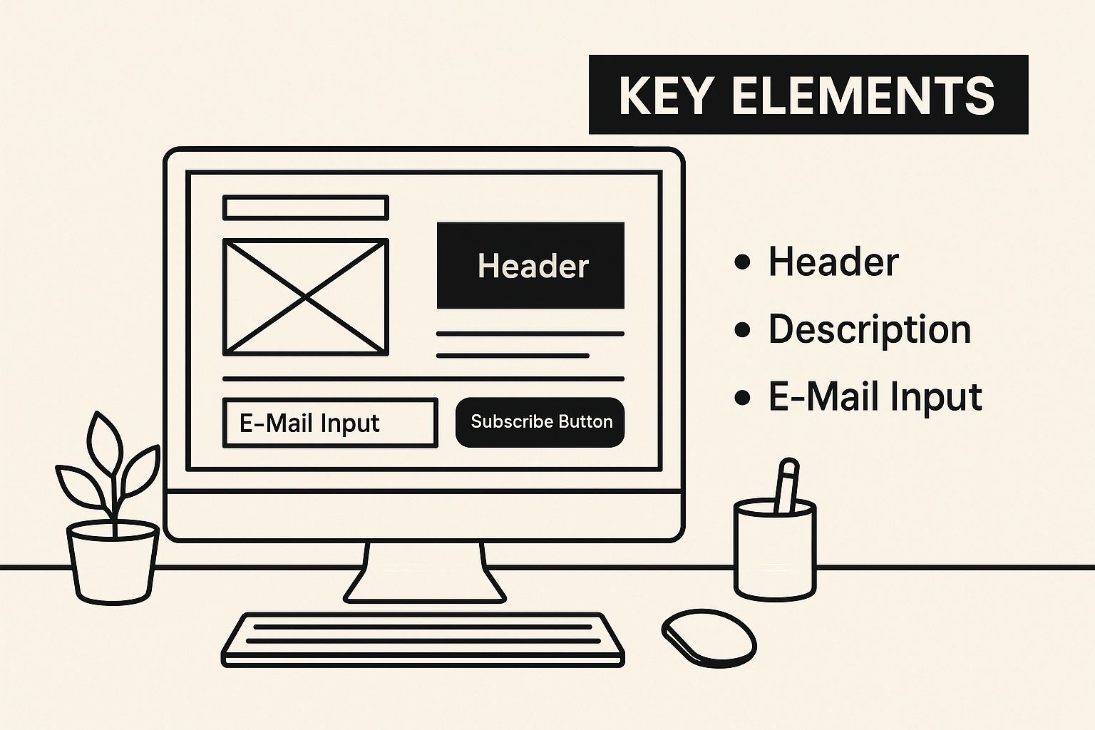
As you can see, a clear headline, a compelling value proposition, and a dead-simple form are the foundational pieces of any design that’s serious about conversions. Now, let’s dissect each of these parts, not just explaining what they are, but why they're so critical for success.
The Irresistible Headline
Your headline is the first thing a visitor reads. That makes it your single most important piece of copy. It has one job: grab attention and make a powerful promise. It must instantly answer the silent question every visitor has: "What's in this for me?"
A weak headline is generic and forgettable. A strong one is specific, sparks curiosity, and screams benefits. For example, instead of "Sign Up for Our Newsletter," try something like "Get Smarter About Crypto in 5 Minutes a Day." The first is a boring command; the second is a clear, tangible benefit.
The Crystal-Clear Value Proposition
If the headline is the hook, your value proposition is the substance. This is usually a subheadline or a short paragraph right below the headline that expands on its promise. It needs to clearly spell out the unique value subscribers will get.
This is your chance to set expectations and show why you're different. A great value proposition answers a few key questions:
- What content will I get? (e.g., weekly marketing case studies, daily tech news, monthly growth hacks)
- What makes it unique? (e.g., insights from industry experts, curated by a team of journalists, data you won't find anywhere else)
- How often will I receive it? (e.g., every Tuesday morning, the first of every month)
Clarity here is non-negotiable. Ambiguity is the absolute enemy of conversion. If someone has to guess what your newsletter is about, you’ve already lost them.
Trust-Building Social Proof
People are far more likely to do something if they see others are already doing it and loving it. This is the power of social proof, and it's a vital trust-building element for newsletter landing pages. You're asking for access to their inbox—a pretty personal space—so you need to earn their confidence first.
Featuring testimonials or subscriber counts creates a sense of FOMO (Fear Of Missing Out), making visitors want to become part of an established community. In fact, research shows that landing pages have the highest conversion rates of all sign-up form types, averaging 23%, and social proof is a huge driver of that success.
Here are a few proven ways to display social proof:
- Subscriber Count: Showing "Join 50,000+ readers" is a powerful signal of popularity and authority.
- Testimonials: Short, punchy quotes from happy subscribers can be incredibly persuasive. Use real names and photos for an extra layer of authenticity.
- "As Seen On" Logos: If your work has been mentioned by reputable brands or media outlets, show off their logos.
- Expert Endorsements: A glowing review from a well-known figure in your industry can lend you immense credibility overnight.
These elements all work by reducing risk. They whisper to the visitor, "You're making a good decision. Plenty of others have made it before you and are happy they did."
The Frictionless Sign-Up Form
The sign-up form is the final hurdle. Your goal is to make it as effortless as possible. Every extra field you ask for adds friction and gives a potential subscriber another reason to bail.
For most newsletters, an email address is all you really need. Asking for a first name is common if you want to personalize your emails, but you should test whether it hurts your conversion rate. Anything more—like a last name, company, or phone number—is almost always overkill and will crush your sign-up numbers.
The call-to-action (CTA) button is the centerpiece of your form. Steer clear of generic text like "Submit" or "Sign Up." Instead, use action-oriented, value-focused language that reminds them of the benefit.
- Good: "Subscribe Now"
- Better: "Get Weekly Insights"
- Best: "Send Me the Tips"
The copy on your CTA button should complete the sentence, "I want to..." This small psychological trick aligns the action with the user's own intent, making the click feel more natural and compelling.
Design Principles That Drive Engagement
Great design for a newsletter landing page is so much more than just making things look pretty. It's a strategic tool, a way to consciously guide your visitor's attention. An effective page doesn't just look good—it directs the eye, communicates value in a split second, and makes the decision to subscribe feel like a no-brainer.
Think of it this way: your ultimate goal is to create a visual journey with one clear destination: that sign-up button. Every single element, from the colors you pick to the space you intentionally leave empty, must work together to support this one objective. This laser focus is what turns a simple page into a high-performance conversion machine.
Create a Clear Visual Path
Visual hierarchy is how you tell a visitor what to look at first, second, and third. Without it, a page just feels like a confusing jumble of competing elements, which almost always leads to a quick click of the "back" button. A strong hierarchy uses size, color, and placement to create an obvious path for the eye to follow.
Your headline should be the biggest, boldest piece of text on the page. Easy. The value proposition can be slightly smaller, followed by any supporting copy. Finally, your call-to-action button should pop with a contrasting color, making it the undeniable focal point of the entire design. This structure instantly reduces the mental effort needed for a visitor to understand what's going on.
A well-structured visual hierarchy acts like a funnel, channeling a visitor's focus from broad interest (the headline) down to a specific action (the CTA button). It’s about making the right choice the easiest choice.
Another powerful tool here is the strategic use of whitespace, or negative space. It’s not just "empty" space; it's an active element that gives your content room to breathe. Crowded designs feel chaotic and overwhelming, while generous whitespace creates a sense of calm, focus, and even sophistication. Use it to separate distinct sections and draw attention to your most important elements, like the sign-up form itself.
Embrace Mobile-First Design
In this day and age, assuming your audience is sitting at a desktop is a massive mistake. The vast majority of emails are opened on mobile devices, and you can bet the traffic to your newsletter landing page will follow the same trend. A mobile-first design approach isn’t just a good idea anymore; it's absolutely essential.
This means you design for the smallest screen first and then scale up to larger ones. This approach forces you to prioritize your most critical content and create a lean, focused experience right from the start. A page that works perfectly on a phone will also look great on a desktop, but the reverse is rarely true. To get a better handle on this, you can learn more about the core responsive web design principles that ensure a great experience on any device.
The Power of Simplicity and Video
The design and content of your landing page have a direct, measurable impact on its success. We know that pages with shorter content and clear, focused CTAs outperform longer, cluttered pages by 13.5%. This drives home a critical point: simplicity converts.
At the same time, adding video can be a game-changer for engagement. A whopping 38.6% of marketers say video is the top element for boosting landing page conversions. It’s no wonder that 35% of B2B marketers consider landing pages their primary strategy for collecting subscribers.
So, how do you balance these two powerful concepts—simplicity and multimedia?
- Keep Your Layout Clean: Use a single-column layout, especially for mobile. This makes your content incredibly easy to scroll through and digest.
- Use Video Strategically: Embed a short, compelling video (think under 60 seconds) that explains your value proposition. A good video can communicate your message much faster and more effectively than text alone.
- Optimize for Speed: Make sure your video doesn't drag down your page load time. Use a lightweight player and consider "lazy loading," which means the video only loads when the user actually scrolls to it.
By combining a clean, simple layout with a powerful, well-optimized video, you create an experience that's both engaging and respectful of your visitor's time. This approach lets you deliver a strong message quickly, guiding people smoothly toward that subscribe button without any friction.
How to Measure and Optimize Your Performance
Getting your newsletter landing page live is the starting line, not the finish. The real work starts now: turning a good page into a finely tuned conversion machine. Without data, you’re just flying blind, guessing what works instead of knowing for sure.
This isn’t about drowning in a sea of metrics. It's about zeroing in on the key performance indicators (KPIs) that actually tell you what visitors are doing and how effective your page is. By setting up some simple tracking, you can start making data-driven decisions that directly grow your subscriber list.
Pinpointing Your Core Metrics
While a few metrics can offer insights, one stands head and shoulders above the rest for a newsletter landing page: the conversion rate. This is simply the percentage of visitors who successfully subscribe after hitting your page. It's your North Star, the ultimate measure of whether your page is doing its job.
So, what's a "good" conversion rate? A large-scale analysis found the median conversion rate across all industries is 6.6%. This figure is a solid benchmark because it minimizes the skew from extreme outliers. But context is everything—performance varies wildly by niche. Some industries, like events, can see rates as high as 12.3%, while others, like SaaS, hover around 3.8%. You can dig deeper into these landing page conversion benchmarks to see where you might stack up.
Beyond your main goal, a few other metrics provide crucial context:
- Bounce Rate: This is the percentage of visitors who land on your page and leave without doing anything. A high bounce rate might mean your traffic source and your page message are disconnected, or your headline just isn't grabbing their attention.
- Time on Page: How long are people actually sticking around? While not a direct sign of conversion, a super low time on page could suggest your content isn't engaging or your value proposition is unclear.
- Traffic Sources: Knowing where visitors come from (social media, organic search, referral links) helps you understand which channels are sending you the most engaged, ready-to-convert audience.
The Power of A/B Testing
Once you have your baseline numbers, it’s time to start optimizing with A/B testing, also known as split testing. It's the simple process of creating two versions of your page (Version A and Version B) with one key difference, then showing each version to different segments of your audience to see which one performs better.
A/B testing takes the guesswork out of optimization. Instead of debating whether a headline is good, you can let your audience’s actions give you a definitive, data-backed answer.
This methodical approach lets you isolate variables and understand exactly what drives more sign-ups. You can systematically improve every single part of your page over time.
What to Test on Your Landing Page
To avoid getting overwhelmed, test one thing at a time. Start with the elements that are likely to have the biggest impact on your conversion rate.
- Your Headline: Pit a benefit-driven headline against one that sparks curiosity. For example, "Get Smarter in 5 Minutes" vs. "The Newsletter 50,000+ CEOs Read."
- Your Call-to-Action (CTA): Play with the button text ("Subscribe Now" vs. "Send Me the Tips"), the button color, and even its placement on the page. Small changes can make a big difference.
- The Form: Test asking for just an email address against asking for a name and email. Does the added personalization from using their name in emails outweigh a potential drop in sign-ups? Only a test will tell you.
- Social Proof: Try out different kinds of proof. Do testimonials from happy readers outperform a simple subscriber count? Does adding logos of companies where your subscribers work build more trust?
- The Hero Image or Video: Test a static image against a short, compelling video that quickly explains your newsletter's value.
By constantly tracking your metrics and running targeted A/B tests, you create a powerful feedback loop for improvement. This data-driven approach is the secret to systematically turning your newsletter landing page into your most powerful tool for audience growth.
Alright, let's move from theory to practice. Talking about the elements of a great landing page is one thing, but seeing them in action is where the real lightbulbs go off. We're going to pull back the curtain on a few killer newsletter landing pages from around the web.
Each of these examples gets something incredibly right—whether it's a crystal-clear value proposition, genius social proof, or just a stunningly simple design. We'll break down exactly what makes them tick and tie it all back to the principles we've covered. You'll walk away with some concrete ideas you can steal for your own project.
The Power of Extreme Clarity
One of the best in the business comes from a brand that has completely mastered simplicity: Morning Brew. Their landing page is a masterclass in getting the point across quickly and confidently.
Take a look at how clean and effective this is.
Right away, you know exactly what you're getting: "the daily email that makes reading the news actually enjoyable." And you know the commitment: "Stay informed and entertained, for free." It's all right there, above the fold. This hyper-clear messaging, paired with a single, impossible-to-miss sign-up form, removes every bit of friction. Subscribing feels like a no-brainer.
This design wins because it ruthlessly eliminates distractions. The headline is all about the benefit, the sub-headline hammers that value home, and the social proof—"4m+ readers"—is just too big to ignore. It’s a perfect example of a page that respects your time and cuts straight to the chase.
Leveraging Niche Authority and Social Proof
When you're talking to a specialized audience, your landing page better speak their language. A fantastic example of this in the wild is Milk Road, a newsletter deep in the world of cryptocurrency. Their page is laser-focused.
The headline, "Get smarter about crypto," is a direct and powerful promise. But where they really shine is in building trust. They use social proof that’s perfectly tailored to their niche, featuring logos and shout-outs from respected names in the crypto community.
Flaunting endorsements from industry leaders creates a powerful sense of FOMO (Fear Of Missing Out). It tells visitors, "The experts are already here. You should be, too."
This simple tactic turns the act of subscribing into something more—it feels like you're joining an exclusive club of insiders. That's a powerful psychological nudge that builds massive credibility and drives people to sign up.
Key Takeaways from Milk Road:
- Speak Your Niche's Language: Use the lingo and hit the pain points that only your target audience understands.
- Use Relevant Social Proof: A testimonial from a random person is good. An endorsement from a titan in your industry is gold.
- Stay On-Brand: The visuals, the copy, and even the mascot on Milk Road's page all scream "crypto," creating a cohesive and unforgettable brand experience.
Giving a Glimpse Inside
Sometimes, the best way to sell your newsletter is to just show people what they're going to get. The Gist, a sports news newsletter, does this brilliantly by making their content the hero of the page. Their landing page features a hero image that’s just a preview of the newsletter itself on different devices.
This is such an effective move because it completely demystifies the product. Visitors aren't left wondering what they're signing up for; they can see the clean layout, the fun tone, and the easy-to-read format right away. It helps them picture themselves reading it before they've even typed in their email address.
By pairing this visual sneak peek with a punchy headline and a minimalist sign-up form, they build a totally persuasive case. It’s all about building trust through transparency, showing visitors exactly what’s behind the curtain and taking all the guesswork out of the decision. When you offer that kind of clarity, subscribing feels like a safe, smart choice.
Of course. Here is the rewritten section, crafted to sound like it was written by an experienced human expert, following all your specific instructions.
Common Landing Page Mistakes to Avoid
Building a landing page that actually converts is as much about dodging the common bullets as it is about using the right ammo. Honestly, one of the fastest ways to get good at this is to learn from the mistakes everyone else makes. It’s a shortcut that helps you sidestep the classic blunders that tank conversion rates and leave visitors confused.
Even tiny errors can have a surprisingly huge impact on your results. By getting familiar with these frequent slip-ups, you can build a much stronger, more persuasive page right out of the gate. It'll save you a ton of time, effort, and most importantly, precious sign-ups.
Mistake 1: Confusing Calls to Action
This is the big one. The absolute single biggest mistake I see is a landing page with more than one main goal. Your newsletter landing page has one job and one job only: get that subscription. The moment you start adding links to your blog, your social media, or other products, you’re creating decision paralysis.
Think of it this way: every extra option you give someone is an exit ramp off the highway to conversion. The fix? Be ruthless with simplicity. Get rid of all distracting navigation links and competing buttons. You want every pixel on that page to funnel the visitor's attention toward that single, crystal-clear call-to-action button.
Mistake 2: Vague and Uninspired Headlines
A headline like "Our Newsletter" or "Subscribe Here" is a massive wasted opportunity. Your headline is your first—and often best—chance to communicate real value. It has to instantly answer the visitor's most pressing question: "What's in it for me?"
Instead of a boring command, you need a benefit-driven headline. Frame it as a solution or a desirable outcome. For example, a crypto newsletter shouldn't just say "Crypto News." It should say something like, "Get Smarter About Crypto in 5 Minutes." See the difference?
A great headline doesn't just describe the newsletter; it sells the transformation the newsletter provides. It promises a better, smarter, or more informed version of the reader.
To nail this, take a few minutes to brainstorm at least five different headlines that focus purely on the subscriber's end benefit. Once you have a couple of good ones, A/B test your top two and let the data tell you which one truly connects with your audience.
Mistake 3: Asking for Too Much Information
Every single field you add to your sign-up form creates more friction. It’s so tempting to try and gather all the data you can—name, company, phone number—but for a simple newsletter, it’s a huge turn-off. The more you ask for, the more you can expect your conversion rate to drop.
For most newsletters, an email address is all you really need to get started. If you have a solid personalization strategy that requires a first name, you can test adding it, but just be ready for a potential dip in sign-ups. Keep your form as minimal as possible to make the whole process feel effortless. This approach mirrors key principles in development, where streamlining processes is essential; you can see similar logic in the best practices for software testing.
Mistake 4: Neglecting Social Proof
Asking for someone's email is asking them to trust you. If your page has zero signals that other people have trusted you and found it worthwhile, you're making that decision much, much harder for new visitors. Without any social proof, your claims about being valuable are just that—unproven claims.
The good news is that this is an easy fix with a massive payoff. Here are a few simple ways to add those crucial trust signals:
- Show Subscriber Numbers: Even a modest number like "Join 500+ subscribers" is far more persuasive than saying nothing at all.
- Add Testimonials: Feature short, punchy quotes from happy readers. Using real names and photos if you can adds another powerful layer of authenticity.
- Use Logos: If you know that people from well-known companies are on your list, showcasing their logos can be a powerful form of endorsement.
Got Questions? We've Got Answers
When you're building a newsletter landing page, a few questions always seem to pop up. Let's tackle them head-on so you can skip the common pitfalls and build a page that works from day one.
How Many Form Fields Should I Use?
This is the classic tug-of-war between gathering data and getting signups. For a newsletter landing page, the answer is almost always the same: use as few fields as you possibly can.
Every extra box you ask someone to fill out is another hurdle, another tiny reason for them to just leave. In most cases, all you truly need is an email address. If you have big plans for personalization, you can test adding a "First Name" field, but keep a close eye on your conversion rate. If signups dip, you'll know the extra personalization isn't worth the cost.
Should I Include Navigation Links on My Page?
This one's easy: a hard no.
Think of it this way: a landing page has one job. A navigation menu with links to your blog, services, or homepage is like opening a dozen side doors in a room with only one exit sign. You’re just inviting people to wander off before they do the one thing you want them to do.
Your newsletter landing page should have a single, unmissable path forward: the subscribe button. By stripping away all other navigation, you create a focused, distraction-free tunnel that guides visitors straight to the prize.
This isn't a limitation; it's a feature. It's about ruthless simplicity, ensuring every ounce of your visitor's attention goes toward understanding the value of your newsletter and hitting "subscribe."
What Is a Good Conversion Rate?
While this number can swing wildly depending on your industry and where your traffic comes from, a solid benchmark to shoot for is between 5% and 10%. The median conversion rate across all industries tends to float around 6.6%, but don't get too hung up on that.
The most important number is your number. Your first goal is to establish a baseline. From there, your only job is to consistently nudge it upward through A/B testing and other smart optimizations.
How Do I Drive Traffic to My New Page?
Your amazing page is live! Now, how do you get people to actually see it? Here are a few dead-simple ways to get the ball rolling:
- Link From Your Website: Add a clear call-to-action in your site's header, footer, or sprinkle it within relevant blog posts. Make it easy for your existing audience to find.
- Use Your Email Signature: This is free real estate! Add a short, compelling link to your page in the signature of every email you send.
- Promote on Social Media: Announce your newsletter on your social channels. Even better, pin a post with the link to the top of your profiles so it’s the first thing new followers see.
Ready to build and launch your own web applications without writing a single line of code? Capacity uses advanced AI to turn your ideas into full-stack apps, from landing pages to complex SaaS products, in minutes. Get started for free at Capacity.so.